Archer
Rebrand Work
Background
After decades as Archer Malmo, our agency was ready for a shift. We chose to evolve into "Archer" — a name that not only streamlined our identity but also opened up rich visual and metaphorical territory.
As I was tackling the rebrand challenge, this wasn’t just about a name change. It was about people.
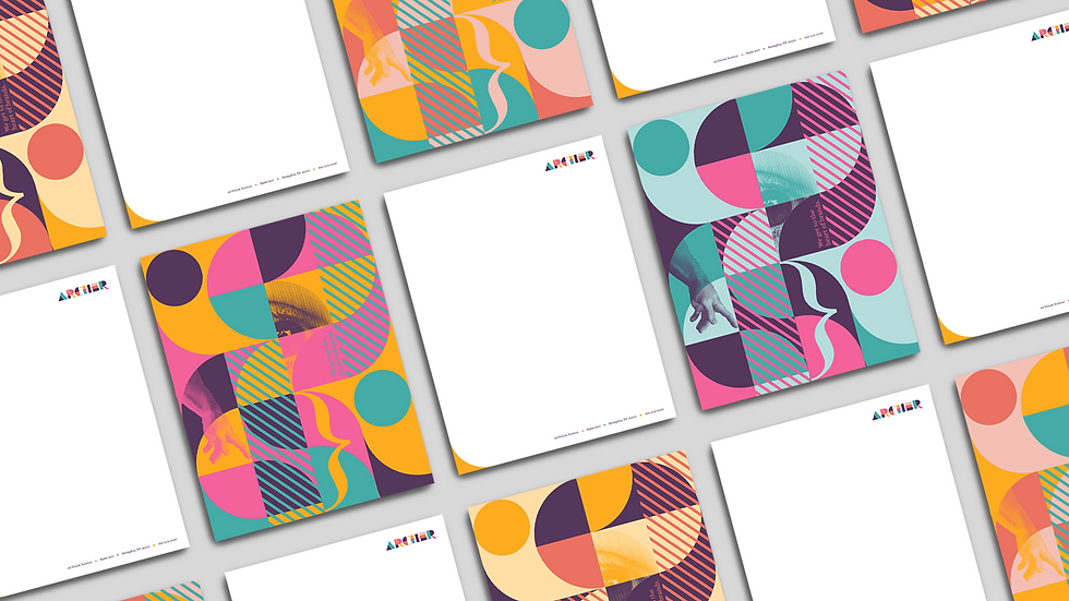
Having spent nearly two decades at Archer, I believed our greatest strength wasn’t just in our creative output—it was in the collective talent, perspectives, and quirks of our people. Archer wasn’t a single, monolithic entity. It was a sum of individuals, each bringing their own movement, color, and energy to the table.

So, I built a visual language that celebrated this individuality—a system of dynamic, modular elements, each representing a unique team member. These elements had their own motion, personality, and style, but together, they formed something bigger. Archer.
This concept was rooted in how we work — collaboratively, building upon each other. It reflected what makes us different: a collection of distinct voices coming together to create powerful ideas.


Credits
Joseph Holiday